Two popular fonts used for developing papers, web sites, publications, marketing materials, and more are serif and sans serif. Serif fonts may be identified by the minuscule lines, or “foot,” that extend from the letters, while sans serif types lack these lines.
Why Are Typefaces Important?
The font you choose may appear unimportant whether you’re writing a booklet for marketing purposes or designing a poster. In fact, fonts have a significant influence on how well you can communicate your message and draw in your target audience.
If you use the incorrect font, your project may not accomplish what you had in mind. On the other side, your message will be more impactful and simpler to read if you use the proper font.
Categories of typefaces
You may select the best font category for your next project by being aware of the meaning associated with each one. However, if you’re used to browsing your font selections and picking one at random, you may want a more thorough introduction.
Serif, sans serif, and script fonts basically fall into three groups. Below, we’ll go into detail about how each font group differs from the others. But for the time being, it’s critical to remember that while there are countless numbers of fonts accessible, knowing in advance whether you want a serifs, sans serif, or script typeface can considerably aid you in your search.
Once you’ve chosen the specific mood or feelings you want your material to arouse, you may match those feelings with a font. Different typographic designs evoke various sentiments. Make sure the one you choose complements the tone of your article.
What exactly are serif and sans serif fonts? What distinguishes them, and how can you tell them apart?
Serif
A serif typeface is what? The tiny lines or strokes that protrude from the letters make this font easy to identify. The I and “f” in the text above have distinct feet, as you can see. The ends of the “S” also extend up and down
When Would You Use a Serif Typeface?
Serif fonts are among the most traditional ones. Due of their advanced age, they are frequently connected with a classic, romantic, elegant, formal, and established ambiance. Times New Roman, Georgia, and Garamond are a few popular serif types.
Many people hold the opinion that serif fonts should be used in printed works because the tiny serifs help us recognise the various letters more quickly and easily, although that may not always be the case.
In any case, serif fonts are a wise choice if you want to portray expertise and reliability in your message. Serif fonts are a popular choice among companies because they offer consumers greater trust in them and help them stand out from competitors who employ sans serif fonts.
Serif Font Types
Serif types come in three varieties: slab serif, transitional serif, and humanist serif. Although there are a few other serif font types, including Renaissance, Baroque, Modern, and Wedge, we’ll concentrate on the first three.
- Humanist Serif
Humanist serif fonts mimic the contrasted strokes of traditional calligraphy. The first Roman types were humanist. Low contrast between strokes and a tiny x-height are further characteristics of Humanist fonts. Humanist serif typefaces are often used to publish classic and conventional material, such as books and essays. A humanist serif typeface, Adobe Garamond, is used in the picture above.
- Transitional Serif
Transitional serif fonts are often employed in academic and legal writing because they feature stronger serifs and more striking contrast between the strokes. Transitional fonts eliminate the pen’s impact. This is shown, for instance, by the vertical tension in the letter bowls, which refers to the letter’s weakest portion. In Humanist fonts, the vertical stress is really on a diagonal as that is how a letter is often stressed when words are written by hand. In a Transitional typeface, the thinnest section is entirely vertical. Baskerville and Georgia are examples of transitional serif types.
- Slab Serif
Egyptian, square, and slab serif types feature thick, boxy serifs with little to no contrast in the letter strokes. This gives off a warm, authoritative vibe akin to that of a marketing application. A stronger font was required because new typefaces were required for advertising and other purposes. Slab Serif is often used to describe monospaced text. The slab serif types Courier and Rockwell are both widely used.
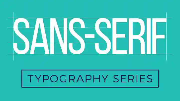
Serif sans
Serif fonts are more traditional; sans serif typefaces are more contemporary. The French term “sans,” which means “without,” is used to describe them since they lack the strokes that set a serif font apart. Sans serif fonts are often employed to represent something tidy, simple, approachable, or contemporary.
Arial, Helvetica, Open Sans, Calibri, and Verdana are a few of the most widely used sans serif types. Because screens have lower DPI (dots per inch) than paper, sans serif fonts are often employed on the web for lengthy passages of text. Sans serif typefaces are often simpler, making them easier for kids to read.
When Would You Use a Sans Serif Typeface?
A sans-serif font can be the ideal option if you want to project a warm, inviting atmosphere. Many businesses use sans serif fonts to project an image of being youthful, cool, and informal. This font genre is often used by start-up and tech firms to communicate their relatability and cutting-edge aesthetic. Due to the improved readability, as we indicated previously, this is also the favoured font type for creating websites.
Sans Serif Font Types
Humanist, transitional, and geometric sans-serif typefaces are the three primary categories.
First: Humanist Sans Serif
Humanist sans serif types feature contrasted, simple strokes that resemble calligraphy. These fonts are often used in government, educational, and financial work because their designs work well for tiny writing. Whitney and Gill Sans are regarded as humanist sans serif types.
Second: generation Sans Serif
Transitional sans serif fonts are more erect and consistent than Humanist types, and they feature strong strokes. Their understated, contemporary vibe is perfect for writing about technology and transportation.
Third: Geometric Sans Serif
The letters of geometric sans serif fonts are built from geometric forms, giving them a rigid, impartial, and standardised appearance. Most letter formats are straightforward. Since “a” has an opening, additional letters with the same sort of opening would also have circular or square openings. It might be more challenging to read geometric fonts, which are often employed in science or building. A few of examples of geometric fonts are Europa and Futura PT.
Related posts:


Categories
- Apps (1)
- Automotive (23)
- Beauty (7)
- Business (118)
- Celebrities (2)
- Digital Marketing (21)
- Ecommerce (1)
- Education (18)
- Entertainment (25)
- Events (6)
- Features (4)
- Fitness (10)
- Food (2)
- Forex & Crypto (21)
- General (105)
- Health (48)
- House (61)
- Lifestyle (48)
- Marketing (8)
- Parenting (3)
- Pets (10)
- Real Estate (7)
- Safety and Security (11)
- Social Media (20)
- Sports (104)
- Technology (67)
- Travel (22)


